In the previous tutorial, we learned why data visualization is important and how we can create plots using matplotlib. In this tutorial, we’ll learn about another data visualization library called Seaborn, which is built on top of matplotlib. But why do we need seaborn if we have matplotlib? Using seaborn you can make plots that are visually appealing and not just that seaborn is known for a range of plots that are not present in matplotlib that could be quite helpful in data analysis.
Before going into seaborn it is important that you know about matplotlib. If you don’t know matplotlib you can learn about it in our previous article.
Installing Seaborn
Unlike other libraries we’ve worked on until now seaborn doesn’t come pre-installed with anaconda but don’t worry we can install it using conda or pip.
conda install -c anaconda seaborn   #Install using conda

pip install seaborn    # Install using pip
Importing Seaborn and Dataset
Conventionally seaborn is imported as sns, why you ask? Well, I had the same question! I mean sns is not an acronym for seaborn no matter how you see it. Turns out it’s actually an insider joke. You can read more about it here.
For this tutorial, we’ll be using Students Performance Dataset on Kaggle. Now that everything is cleared let’s start importing the dataset and libraries.
import pandas as pd
import numpy as np
import seaborn as sns
import matplotlib.pyplot as plt
sns.set_style('darkgrid')

df = pd.read_csv('data.csv')
df.head()
But what’s this set_style() used for? Let’s understand.
Plot Styles in Seaborn
Using seaborn, you can actually set how you want your plot to be displayed. You can set these style using sns.set_style(). I really like the darkgrid style so let me show you how to set it.
sns.set_style('darkgrid')Apart from darkgrid, there are other styles that you can use like:-
- darkgrid
- whitegrid
- dark
- white
- ticks
Now that we have everything set up, Let’s get plotting!
(adsbygoogle = window.adsbygoogle || []).push({});
Plotting in Seaborn
sns.scatterplot()
This is used to create scatter plots, we can pass data for the x and y-axis and it’ll create a scatter plot for them.
sns.scatterplot(x = df['math score'], y = df['reading score'])
plt.show()

In seaborn, we can actually pass our data frame as value for data argument and then just pass labels to x and y, let’s see how.
plt.figure(figsize = (9,6))
sns.scatterplot(x = 'math score', y = 'reading score',data = df)
plt.show()

Since Seaborn is built on top of matplotlib we can use plt.show() just like we did in matplotlib, in fact using matplotlib we can customize the seaborn plot. Now our plot is a bit boring let’s customize it a bit!
plt.figure(figsize = (9,6))
sns.scatterplot(x = 'math score',
                y = 'reading score',
                hue = 'gender',
                data = df,
                alpha = 0.8
)
plt.show()
Now let’s see what happened, We plotted a scatter plot between ‘math score’ and ‘reading score’, we set alpha = 0.8 to define the opacity of dots, and we passed hue as ‘gender’ with color the dot to its corresponding gender. For example, the bottom left dot is blue meaning that point had the gender Female in the data frame.
sns.countplot()
This creates a frequency plot that tells the no. of occurrence of the corresponding element in the column.
plt.figure(figsize = (9,6))
sns.countplot(x = 'race/ethnicity',
              data = df
)
plt.show()
(adsbygoogle = window.adsbygoogle || []).push({});
sns.displot()
This creates a histogram for the corresponding distribution. By default, it displays the KDE of the distribution which you can turn off by setting kde = False.
plt.figure(figsize = (9,6))
sns.displot(x = df['math score'], kde = False)
plt.show()

sns.kdeplot()
This creates a Kernel Density Estimate plot or KDE plot of the distribution. You can learn about KDE here.
plt.figure(figsize = (9,6))
sns.kdeplot(x = df['math score'])
plt.show()

sns.regplot()
This creates a scatter plot that contains a regression line for the data. We’ll learn about regression lines in the next article but for now, think of it as a line that tells the relationship between 2 points.
plt.figure(figsize = (9,6))
sns.regplot(x = df['math score'],
            y = df['reading score'],
            scatter_kws = {'color':'pink'},
            line_kws = {'color':'red'}
)
plt.show()
Using scatter_kws and line_kws we can set characteristics for lines and points in the plot.
sns.lmplot()
This is almost the same as regplot but it can create a regression line for all the categories of columns set as hue.
sns.lmplot(x = 'math score',
           y = 'reading score',
           hue = 'gender',
           data = df
)
plt.show()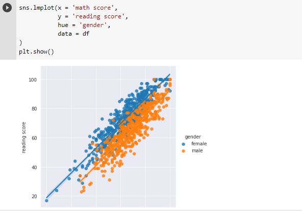
sns.pairplot()
This plots pairwise bivariate distributions in a dataset. pairplot() only works for numerical columns. You have to pass the subsetted data with columns you want to plot distribution in between.
sns.pairplot(df[['math score',
                 'reading score',
                 'writing score']]
)
plt.show()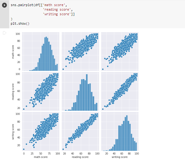
sns.jointplot()
This plots both univariate and bivariate distribution between 2 columns.
sns.jointplot(x = 'math score',
              y = 'reading score',
              data = df
)
plt.show()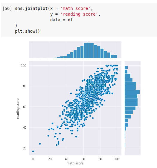
Let’s try adding a hue to see what happens.
sns.jointplot(x = 'math score',
              y = 'reading score',
              hue = 'gender',
              data = df
)
plt.show()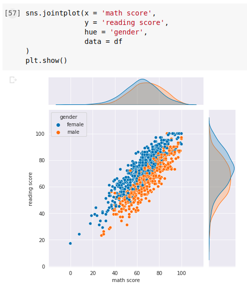
sns.boxplot()
Creates a boxplot that gives 5 number summary of the distribution. You can create multiple box plots too. Boxplots also display the outliers in the dataset.
For Single Continuous Column
sns.boxplot(x = 'math score',
            data = df
)
plt.show()
For All Numerical Columns in the Dataset
sns.boxplot(data = df)
plt.show()

sns.swarmplot()
This plots a categorical scatterplot with non-overlapping points. A swarm plot can be drawn on its own, but it is also a good complement to a box or violin plot.
plt.figure(figsize = (12,8))
sns.swarmplot(x = 'race/ethnicity',
              y = 'math score',
              data = df,
              alpha = 0.8
)
plt.show()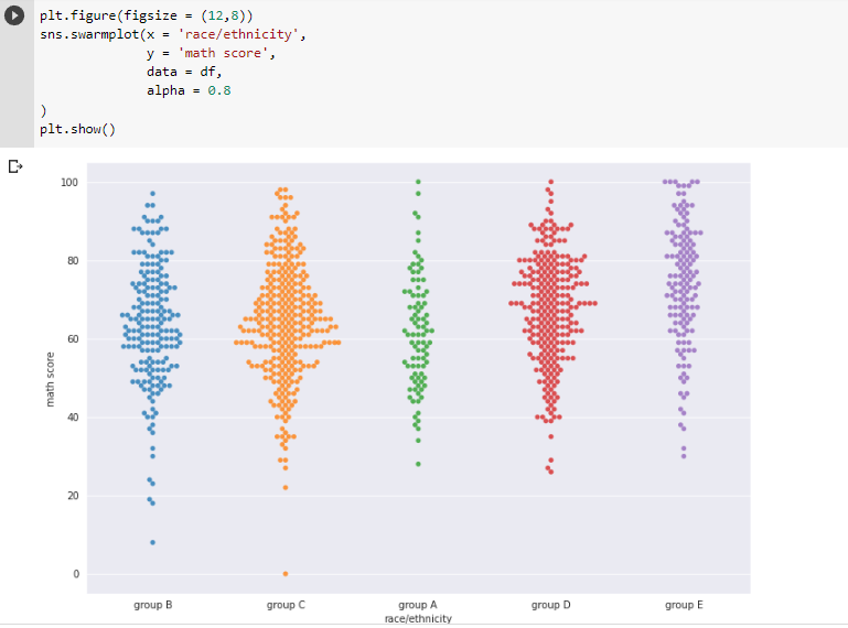
sns.heatmap()
Plots heatmap of the data. Most commonly used to create correlation heatmaps. annot = True is used to display the value of the cell.
sns.heatmap(df.corr(),
            annot = True,
            cmap = 'inferno')
plt.show()
Color pallets in Seaborn
Seaborn allows us to set custom color palettes. We can simply create an ordered Python list of color hex values.
plt.figure(figsize = (12,8))
colors = [
           '#F8D030',
           '#E0C068',
           '#EE99AC',
           '#C03028',
           '#F85888'
]
sns.stripplot(x = 'race/ethnicity',
              y = 'math score',
              data = df,
              palette = colors
)
plt.show()
Strip Plots are like swarm plots but with overlapping points.
Congratulations! Now you are capable to create plots in the seaborn. You can use these plots to gather insights into your data. There are various other plots that you can explore here, but now you know how to plot the important ones.
Thanks for reading the Seaborn: Create Elegant Plots article, hope you enjoyed and learned enough from it. But, still, if you found any problems, let us know in the comments.
(adsbygoogle = window.adsbygoogle || []).push({});
Check this video for more:
Credits to edureka!
Also Read:
- Flower classification using CNNYou know how machine learning is developing and emerging daily to provide efficient and hurdle-free solutions to day-to-day problems. It covers all possible solutions, from building recommendation systems to predicting something. In this article, we are discussing one such machine-learning classification application i.e. Flower classification using CNN. We all come across a number of flowers…
- Music Recommendation System in Machine LearningIn this article, we are discussing a music recommendation system using machine learning techniques briefly. Introduction You love listening to music right? Imagine hearing your favorite song on any online music platform let’s say Spotify. Suppose that the song’s finished, what now? Yes, the next song gets played automatically. Have you ever imagined, how so?…
- Top 15 Python Libraries For Data Science in 2022
 Introduction In this informative article, we look at the most important Python Libraries For Data Science and explain how their distinct features may help you develop your data science knowledge. Python has a rich data science library environment. It’s almost impossible to cover everything in a single article. As a consequence, we’ve compiled a list…
 - Top 15 Python Libraries For Machine Learning in 2022Introduction In today’s digital environment, artificial intelligence (AI) and machine learning (ML) are getting more and more popular. Because of their growing popularity, machine learning technologies and algorithms should be mastered by IT workers. Specifically, Python machine learning libraries are what we are investigating today. We give individuals a head start on the new year…
- Setup and Run Machine Learning in Visual Studio CodeIn this article, we are going to discuss how we can really run our machine learning in Visual Studio Code. Generally, most machine learning projects are developed as ‘.ipynb’ in Jupyter notebook or Google Collaboratory. However, Visual Studio Code is powerful among programming code editors, and also possesses the facility to run ML or Data…
- Diabetes prediction using Machine LearningIn this article, we are going to build a project on Diabetes Prediction using Machine Learning. Machine Learning is very useful in the medical field to detect many diseases in their early stage. Diabetes prediction is one such Machine Learning model which helps to detect diabetes in humans. Also, we will see how to Deploy…
- 15 Deep Learning Projects for Final yearIntroduction In this tutorial, we are going to learn about Deep Learning Projects for Final year students. It contains all the beginner, intermediate and advanced level project ideas as well as an understanding of what is deep learning and the applications of deep learning. What is Deep Learning? Deep learning is basically the subset of…
- Machine Learning Scenario-Based QuestionsHere, we will be talking about some popular Data Science and Machine Learning Scenario-Based Questions that must be covered while preparing for the interview. We have tried to select the best scenario-based machine learning interview questions which should help our readers in the best ways. Let’s start, Question 1: Assume that you have to achieve…
- Customer Behaviour Analysis – Machine Learning and PythonIntroduction A company runs successfully due to its customers. Understanding the need of customers and fulfilling them through the products is the aim of the company. Most successful businesses achieved the heights by knowing the need of customers and dynamically changing their strategies and development process. Customer Behaviour Analysis is as important as a customer…
- NxNxN Matrix in Python 3A 3d matrix(NxNxN) can be created in Python using lists or NumPy. Numpy provides us with an easier and more efficient way of creating and handling 3d matrices. We will look at the different operations we can provide on a 3d matrix i.e. NxNxN Matrix in Python 3 using NumPy. Create an NxNxN Matrix in…
- 3 V’s of Big dataIn this article, we will explore the 3 V’s of Big data. Big data is one of the most trending topics in the last two decades. It is due to the massive amount of data that has been produced as well as consumed by everyone across the globe. Major evolution in the internet during the…
- Naive Bayes in Machine LearningIn the Machine Learning series, following a bunch of articles, in this article, we are going to learn about the Naive Bayes Algorithm in detail. This algorithm is simple as well as efficient in most cases. Before starting with the algorithm get a quick overview of other machine learning algorithms. What is Naive Bayes? Naive Bayes…
- Automate Data Mining With PythonIntroduction Data mining is one of the most crucial steps in Data Science. To drive meaningful insights from data to take business decisions, it is very important to mine the data. Deleting or ignoring unnecessary and unavailable parts of data and focusing on the correct and right data is beneficial, and more if required in…
- Support Vector Machine(SVM) in Machine LearningIntroduction to Support vector machine In the Machine Learning series, following a bunch of articles, in this article, we are going to learn about Support Vector Machine Algorithm in detail. In most of the tasks machine learning models handle like classifying images, handling large amounts of data, and predicting future values based on current values,…
- Convert ipynb to PythonThis article is all about learning how to Convert ipynb to Python. There is no doubt that Python is the most widely used and acceptable language and the number of different ways one can code in Python is uncountable. One of the most preferred ways is by coding in Jupyter Notebooks. This allows a user…
- Data Science Projects for Final YearDo you plan to complete your data science course this year? If so, one of the criteria for receiving your degree can be a data analytics project. Picking the best Data Science Projects for Final Year might be difficult. Many of them have a high learning curve, which might not be the best option if…
- Multiclass Classification in Machine LearningIntroduction The fact that you’re reading this article is evidence of the fact that you’ve finally realised that classification problems in real life are rarely limited to a binary choice of ‘yes’ and ‘no’, or ‘this’ and ‘that’. If the number of classes that the tuples can be classified into exceeds two, the classification is…
- Movie Recommendation System: with Streamlit and Python-MLHave you come across products on Amazon that is recommended to you or videos on YouTube or how Facebook or LinkedIn recommends new friend/connections? Of course, you must on daily basis. All of these recommendations are nothing but the Machine Learning algorithms forming a system, a recommendation system. Recommendation systems recommend relevant items or content…
- Getting Started with Seaborn: Install, Import, and UsageSeaborn Library in Python Seaborn is a visualization library for plotting good-looking and stylish graphs in Python. It provides different types of styles and color themes to make good-looking graphs. The latest version of the seaborn library is 0.11.2. Installation Mandatory dependencies numpy (>= 1.9.3) scipy (>= 0.14.0) matplotlib (>= 1.4.3) pandas (>= 0.15.2) Importing Seaborn Library Using Seaborn Library…
- List of Machine Learning AlgorithmsIn this article on the list of Machine Learning Algorithms, we are going to learn the top 10 Machine Learning Algorithms that are commonly used and are beginner friendly. We all come across some of the machines in our day-to-day lives as Machine Learning is making our day-to-day life easy from self-driving cars to Amazon virtual assistant “Alexa”….