In this article, let us build a simple Machine Learning model for Breast cancer Detection. This is a beginner-friendly project so if you are exploring classification algorithms, this will help you to understand them better.
Over the past decade, machine learning techniques have been widely used in intelligent health systems, particularly for breast cancer diagnosis and prognosis. Breast Cancer is one of the most common cancers globally. So with the help of Machine Learning, we can build a model to classify the type of cancer, so it will be easy for doctors to provide treatment at the right time. Early diagnosis of breast cancer can dramatically improve prognosis and chances of survival, as it can promote timely clinical treatment of patients. This is a Classification problem and the main goal is to build the model which classifies between Malignant and Benign types of Cancer.
Steps in building our Machine Learning Model
This is a beginner Machine Learning project, so we will try to build our model in an easy and simple way. Let us start our project by examining the steps required to build the Machine Learning model for breast cancer detection.
Importing Libraries & Loading Dataset
Exploratory analysis of data
Data Preprocessing
Building machine learning models
Prediction of outcome
Importing the required Libraries
As the first step, let us import the libraries required for the project. If you are not having these libraries, kindly install them using the following commands.
If you already have the required libraries skip the previous step and continue with importing the libraries directly into our project.
#Importing the required libraries import numpy as np import pandas as pd import matplotlib.pyplot as plt import seaborn as sns
We can download the dataset required for this project from Kaggle. Kaggle is a place where we can find thousands of datasets to use for our projects. It is a great platform that has many machine learning competitions and provides real-world datasets. You can work on this project in the Jupyter notebook integration provided in the Kaggle itself. For that sign in to Kaggle and create your account.
There are 30 numeric, predictive attributes in the dataset of Breast Cancer Detection. The Information of some of the attributes are given below:
– radius (mean of distances from the center to points on the perimeter) – texture (standard deviation of gray-scale values) – perimeter – area – smoothness (local variation in radius lengths) – compactness (perimeter^2 / area – 1.0) – concavity (severity of concave portions of the contour) – concave points (number of concave portions of the contour) – symmetry – fractal dimension (“coastline approximation” – 1)
Loading the data
After importing the libraries, we have to load the data into our project.
If you are using google collab you have to first upload the dataset to access that data. So to upload the dataset run the following command:
#Load the dataset from google.colab import files uploaded = files.upload ()
If you are using Jupyter notebook or notebook provided in Kaggle, we can use the read_csv method in the pandas library to import the dataset.
#Importing the dataset df=pd.read_csv (“data.csv”)
Explore the data
In this step, we will explore our data to understand more about the data. We can check the shape of the dataset, missing values in the data, and other information.
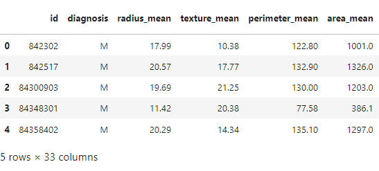
Let us start examining the dataset using the head() method in the pandas library. The head() method displays the rows in the dataset up to the value in the argument. The default parameter of the head() method is 5 rows.
#Displays top 5 rows in the dataset df.head ()
Output:
Let us explore the dataset and see the number of rows and columns in the data set. We can find the dimensions of the dataset using the shape method in the pandas library.
#Displays dimensions of the dataset df.shape
Output:
(569,32)
We can see that there are 569 rows of data which means there are 569 people in this data and 33 columns which means there are 33 features or data points for each person.
We can Continue exploring the data and get a count of all of the columns that contain empty (NaN, NAN, na) values.
#Count the empty values in each column df.isna ().sum()
None of the columns contain any empty values except the column named ‘Unnamed: 32’, which contains 569 empty values. So we can drop that column from the original data set since it adds no value to build the model.
#To drop the column with missing value df=df.drop (‘Unnamed: 32’,axis=1)
Diagnosis is the column that we are going to predict with the help of other columns. Let us explore the different possible values in that column
#Prints unique values in Diagnosis column df[‘diagnosis’].unique()
Output:
array([‘M’, ‘B’], dtype=object)
In which M means malignant and B means Benign type of cancer.
#Count of unique values in Diagnosis column df[‘diagnosis’].value_counts()
Output:
B 357 M 212 Name: diagnosis, dtype: int64
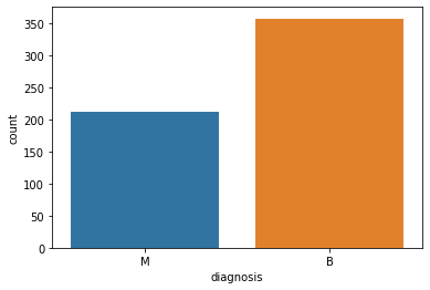
We can identify that out of 569 people, 357 are labeled as B(Benign) and 212 are labeled as M(Malignant)
#Convert column names to a list l=list (df.columns) print (l)
We can check the information about the data such as mean, Standrad Deviation, Minimum value, Maximum value, etc., using the describe method.
#summary of all numeric columns df.describe()
This displays the summary of the columns including the following information
count mean std min 25% 50% 75% max
Visualize the data
The next step is to visualize the information to analyze the data. Data visualization is the graphical representation that contains the information and the data. Visualization of data helps to understand the data better.
countplot() method in the seaborn library is used to show the counts of observations in each category using bars.
#Showing the total count of malignant and benign patients in a counterplot sns.countplot (df[‘diagnosis’]);
Countplot
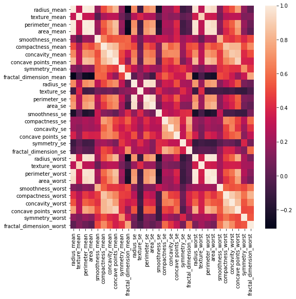
Heatmaps visualize data through variations in coloring. When applied to a tabular format, Heatmaps are useful for cross-examining multivariate data, through placing variables in the rows and columns and coloring the cells within the table. To find a correlation between each feature and target we visualize heatmap using the correlation matrix.
A correlation heatmap is a heatmap that shows a 2D correlation matrix between two discrete dimensions, using colored cells to represent data. The values of the first dimension appear as the rows of the table while the second dimension is a column.
As a next step we are going to encode the categorical data. Categorical data are variables that contain label values instead of numeric values. We can convert them into numeric data for a better predictive model.
So, We have encoded the categorical data Malignant type (M) as 1 and Benign type (B) as 0.
Splitting the dataset
The data has to be usually split into training and testing parts. The training set contains the data with known outputs to help the model learn. Another set of data known as the test set contains data whose output will be predicted by the model. The breaking of data should be 80:20 or 70:30 ratio approximately. The larger part is for training purposes and the smaller part is for testing purposes. This is more important because using the same data for training and testing would not produce good results.
train_test_split method in Sci-kit library is used for this purpose of splitting the data
#Splitting the data into the Training and Testing set x = df.drop (‘diagnosis’,axis=1) y = df [‘diagnosis’] from sklearn.model_selection import train_test_split x_train,x_test,y_train,y_test = train_test_split (x,y,test_size=0.3)
Next, we can check the shape of the training data and testing data.
x_train.shape
Output:
(398, 30)
x_test.shape
Output:
(171, 30)
We can see that the training and testing data are correctly split in the ratio of 70% and 30%.
Feature Scaling
Our dataset may contain features highly varying in magnitudes, range, and units. We need to bring all features to the same level of magnitudes. This can be done by Scaling the data, which means fitting the data within a specific range(example: 0-1).
Let us use the StandardScaler method in Scikit-Learn Library for scaling our data.
#Feature Scaling of data from sklearn.preprocessing import StandardScaler ss = StandardScaler() x_train = ss.fit_transform (x_train) x_test = ss.fit_transform (x_test)
Model selection
We have the clean data to build our model. But we have to find which Machine learning algorithm is best for the data. The output is a categorical format so we will use supervised classification machine learning algorithms. To build the best model, we have to train and test the dataset with multiple Machine Learning algorithms then we can find the best Machine learning model. We are going to fit our model on 4 different classification algorithms namely Logistic Regression, Decision Tree Classifier, Random forest classifier, and Support Vector Machine. And use the algorithm with the highest accuracy among all for our model.
Logistic Regression
Logistic Regression is a Machine Learning classification algorithm that is used to predict the probability of a categorical dependent variable. In logistic regression, the dependent variable is a binary variable that contains data coded as 1 or 0.
#Importing Logistic Regression from Scikit learn library from sklearn.linear_model import LogisticRegression lr = LogisticRegression() #Loading the training data in the model lr.fit (x_train, y_train)
We can use the accuracy_score() function provided by Scikit-Learn to determine the accuracy rate of our model with Logistic regression
#Accuracy Score of Logistic Regression from sklearn.metrics import accuracy_score print(“Accuracy Score of Logistic Regression: “) print (accuracy_score (y_test,y_pred))
Output:
Accuracy Score of Logistic Regression: 0.9824561403508771
Decision Tree Classifier
Decision Tree Classifier takes input as two arrays: an array X, sparse or dense, of shape (n_samples, n_features) holding the training samples, and an array Y of integer values, shape (n_samples,), holding the class labels for the training samples:
#Importing from Decision Tree Classifier from Scikit learn library from sklearn.tree import DecisionTreeClassifier dtc = DecisionTreeClassifier() #Loading the training data in the model dtc.fit (x_train,y_train)
We can use the accuracy_score() function provided by Scikit-Learn to determine the accuracy rate of our model with Decision Tree classifier algorithm.
#Accuracy Score of Decision Tree Classifier from sklearn.metrics import accuracy_score print(“Accuracy Score of Decision Tree Classifier : “) print(accuracy_score (y_test,y_pred))
Output:
Accuracy Score of Decision Tree Classifier: 0.9239766081871345
Random forest classifier
Random Forest is a classifier that contains a number of decision trees on various subsets of the given dataset and takes the average to improve the predictive accuracy of that dataset. Here, we are using the RandomForestClassifier method of ensemble class to implement the Random Forest Classification algorithm
from sklearn.ensemble import RandomForestClassifier rfc = RandomForestClassifier() #Loading the training data in the model rfc.fit (x_train,y_train)
We can use the accuracy_score() function provided by Scikit-Learn to determine the accuracy rate of our model with the Random Forest classifier algorithm.
#Accuracy Score of Random Forest Classifier from sklearn.metrics import accuracy_score print(” Accuracy Score of Random Forest Classifier : “) print ( accuracy_score (y_test,y_pred)
Output:
Accuracy Score of Random Forest Classifier: 0.9473684210526315
Support vector classifier
Now, let us implement our model using the Support vector classifier (SVC). As other classifiers, SVC take input as two arrays: an array X of shape (n_samples, n_features) holding the training samples, and an array y of class labels (strings or integers), of shape (n_samples):
from sklearn import svm svc = svm.SVC () #Loading the training data in the model svc.fit (x_train,y_train)
Let us use the accuracy_score() function provided by Scikit-Learn to determine the accuracy rate of our model with the Support Vector classifier algorithm.
#Accuracy Score of Support vector classifier from sklearn.metrics import accuracy_score print(” Accuracy Score of Support vector classifier: “) print (accuracy_score (y_test,y_pred ))
Output:
Accuracy Score of Support vector classifier : 0.9824561403508771
From the accuracy and metrics above, the model that performed the best on the test data was the Support vector Classifier with an accuracy score of about 98.2%. So let’s choose that model to detect cancer cells in patients. Make the prediction/classification on the test data and show both the Support vector Classifier model classification/prediction and the actual values of the patient that shows rather or not they have cancer.
And yay! we have successfully completed our Machine learning project on Breast Cancer Detection. Hope you have enjoyed doing this project!